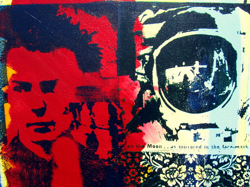
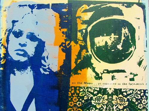
Rediscovering the printing process after nearly 40 years has been an interesting process – disappointingly modern inks are not as rich in colour (earthy colours are very plastic like) and modern waterbased inks don’t become part of the surface, they sit on it, which is incredibly frustrating – the reason I took up printing in the first place was because of the absorbed flatness of the pigments.
The image below is a lithograph I did in 1978.
Printmaking 2011
My heroes have grown old with me or they have died – maybe their death has been a way to freeze time, stop the aging process – not only for them but for me also? ‘Peter’s exhibition was inspired by iconic images he used when he was at art school in the 70s on the theme of Beauty and the Beast – inc Sid and Nancy and Guy the Gorilla! – and I think the results are really bold and impactful.’
I have always been a hoarder, newspaper clippings, postcards etc. It is only now that I have decided to recycle them.
Whatever happened to the Space Age?, a photo by This Window on Flickr.
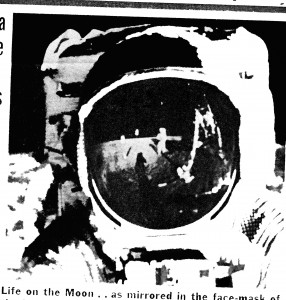 I have just been rummaging through old boxes of stuff and found the picture above – yellowed and faded – it still makes my heart flutter. I wish I’d been to the moon.
Woodcuts
The most inspirational woodcuts (for me) are by Émile Bernard. Émile Henri Bernard (April 28, 1868 – April 16, 1941) is known as a Post-Impressionist painter who had artistic friendships with Van Gogh, Gauguin, Eugene Boch and Cézanne. Most of his notable work was accomplished at a young age, in the years 1886 through 1897. He is also associated with Cloisonnism and Synthetism, two late 19th century art movements. Less known is Bernard’s literary work, comprising plays, poetry, and art criticism as well as art historical statements that contain first hand information on the crucial period of modern art to which Bernard had contributed. Bernard was in many ways, the young, educated and intellectual mentor, who was crucial in intellectualising and inspiring Paul Gauguin during the Pont Aven period of his career. Read more…
‘Bernard’s ideas fired Gauguin’s enthusiasm, and Bernard’s important painting Breton Women in the Meadow (1888; France, priv. col.), a starkly drawn and crudely painted composition depicting a Breton Pardon, enabled Gauguin to go on to produce his own revolutionary painting Vision after the Sermon: Jacob Wrestling with the Angel (1888; Edinburgh, N.G.) in a similar style and composition. Bernard exhibited Cloisonnist paintings and prints of Breton inspiration alongside Gauguin and other artists at the Exposition Universelle of 1889, at the Café Volpini. This exhibition acted as a catalyst on the Nabi group and drew a number of new adherents to the Pont-Aven school.’Text from MoMA.org (original source Oxford University Press)
Methodology
An object or thing never has the same functionality as its name or image…. I think Magritte said something like this 80 or so years ago.
A bit of an odd statement but if you think about it it is very true. An inert object (or landscape) can’t tell you what it is, we rely on our experiences through out our lives to explain what we see. If we see a chequered hillside we know that the boundaries (if they are green) are most likely to be hedges and the whiteish blobs are probably sheep contained within the fields. We can estimate the feel of the landscape: warm, cold, steep, flat etc.
In many respects transferring theses visual clues into (in my case) paint gives a prompt, a reminder of the general feel of the landscape… an estimate.
In all cases the created image lies about its representation. A representation/illusion takes on more realness than the actual physical object, the object then becomes a metaphor for the created illusion. This in turn creates an additional reference for the object, an extra visual adjective eg. ‘The sky was very Turneresque.’ Turner’s illusion becomes a metaphor for the real thing, which vividly describes [in words] the actual sky. The concrete object cannot say everything about itself – it has a limited vocabulary and is unable to say what is required of it, it is on many levels mute.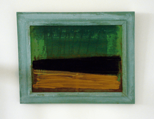
The constant questioning and declassification of what art is and what the content is has lead to this so called crisis in painting (there as always been a crisis in painting) – Painting is dead – the exponents of Conceptual Art tried to destroy the art object but failed – thought and the idea is the object. The primary aims of Conceptual Art in the 1960’s was to carry out a theoretical examination of ‘art’ and through understanding propose ‘concepts as art’. Two and three-dimensional art was in the doldrums, the essence of creating was the new Holy Grail. This was considered to be a bold step, proposing an idea as a work of art left the Artist with very little to exhibit or sell, the written word was usually all that was physically evident….it has taken me nearly 35 years to realize that what I do isn’t pointless and that my unwavering trust in the conceptual philosophies (of artists and writers from Duchamp to Art and Language) has been misplaced. I’m enjoying my painting – for the first time. The ‘world of art’ and the ‘world of everyday life’ had already been discussed in Dada. “Life and art are one,” proclaimed Tzara. Ultimately Dada reduced itself to vandalism, drawing moustaches on the Mona Lisa, instead of destroying the Louvre and genuinly starting again, something a real revolutionary movement would consider as its first option. It increased the status of the most banal object or event into something that ultimately provoked nervous laughter, a childish prank that has been taken seriously ever since. Conceptual Art attempted to be more serious in its approach. Unfortunately the original aims became diffused and the quality of thought became diluted and suffered a similar fate to Dada.
It is possible to tell more about a landscape or object in a painting than to actually experience the real thing – the editing and generalization required in painting enables the experience of the landscape to be viewed in shorthand. The greatest trick is to imply this with the minimum of effort. Unfortunately the majority of landscape art fails miserably however, ‘Lake Lucerne: the Bay of Uri from above Brunnen‘ circa 1844 (below) is the ultimate painting of landscape and nature – it tells a massive story with very little content. This has been an important painting for me since the early 1970’s. I have always admired the New York Abstract Expressionists of the mid 20th century but when I first saw this painting by Turner…… my socks were blown off. It is without doubt a clever (maybe unfinished) conceptual painting.

The scumbled and brilliant paint surface is, at first, difficult to decipher. A small house beneath a cliff is discernible in the lower left corner, while mountains loom on the right hand side of the canvas. As a work begun a year or two after Turner’s 1842 visit to Switzerland and has been connected to a watercolor of the same subject completed that year.
(From the display caption September 2004 Tate Gallery, London)
Road trips, journeys, and speed inspire. The image below was taken on a road trip I did in 2007, with stays in Brussels, Zurich (it was going to be Prague – but the German authorities banned us from their country on the outward journey) Zagreb, Munich, Ipers. Going through France, Belgium, Luxemburg, Switzerland, Austria, Slovenia, Croatia and Germany. We did this in six days. Click on the image for more photographs of our ‘Cannonball’ journey.
I wish I’d painted this (maybe?)
Manet’s Olympia (which is in the Musée d’Orsay) is probably one of my favourite paintings. In 1974 at Stourbridge College of Art I did a series of paintings based on ‘Page 3 models’ and I was intrigued how Manet’s Olympia had the same soft porn feel to it – inviting but not hardcore. I went to Paris in 1978 and took this photo which I’ve just rediscovered. I’ve no idea who the bloke is – he could be her pimp or maybe he was first in the queue.
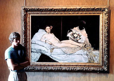
What shocked contemporary French audiences of the late 19th century was not Olympia’s nudity, nor even the presence of her black maid (the black female was regarded by 19th century Europeans as a savage, a nymphomaniac – to have a white woman naked with her maid clothed was a provocative statement). Olympia’s confrontational, erotic gaze and the symbolic references to her as a courtesan (demi-mondaine): the orchid in her hair, her bracelet, pearl earrings and the oriental shawl on which she lies, which are symbols of wealth and sensuality. The black ribbon around her neck, and her single cast-off slipper mark her as a temptress.
The painting was inspired by Titian’s Venus of Urbino, which in turn refers to Giorgione’s Sleeping Venus. Olympia’s authoritative hand (the model was Victorine Meurent) covers her nudity (same as a Page 3 girl) as if to emphasize her independence, sexual dominance and her status as an object of desire. Manet replaced the little dog (symbol of fidelity) in Titian’s painting with a black cat, which symbolized prostitution. People have suggested that she is looking in the direction of a door, as a client barges in unannounced, I would prefer to think she is waiting for me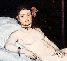
Related articles
- Nancy Spungen – painting (myartmydisease.wordpress.com)
- Links to paintings for sale (myartmydisease.wordpress.com)
- 1978 – painting Guy the Gorilla (myartmydisease.wordpress.com)
- Sid Vicious painting (myartmydisease.wordpress.com)
- “Allergy #11? – painting on canvas (myartmydisease.wordpress.com)
- Guy the Gorilla – painting for sale (myartmydisease.wordpress.com)
- Screen Print on canvas (myartmydisease.wordpress.com)
- La Belle et La Bête (myartmydisease.wordpress.com)


